Day2: Neophyte Shot
So, what do you do when the structure is too big to take into one shot? I'm not sure. I tried to capture a small section, tried getting distance to capture more, and even tried just capturing a sculpture that wasn't part of the building. I settled with this:
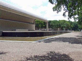
Adjusting slightly to the left I could have caught the corner of the building and still got the water in completely.
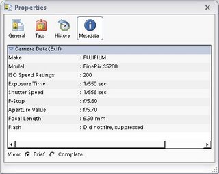
exif data:
When we decided to add the Modern to the shoot the same "this structure is large" predicament...and not any different answers really. The large sculpture did have to be in the shot tho because it feels like part of the building.
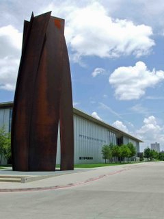
Looks like I could have adjusted vertically a little and went with less parking lot and more sky. Or come in a little closer for some more detail.
exif data:


Adjusting slightly to the left I could have caught the corner of the building and still got the water in completely.
exif data:

When we decided to add the Modern to the shoot the same "this structure is large" predicament...and not any different answers really. The large sculpture did have to be in the shot tho because it feels like part of the building.

Looks like I could have adjusted vertically a little and went with less parking lot and more sky. Or come in a little closer for some more detail.
exif data:

3 Comments:
Two pics: The building and the big sculpture
The building:
- Overall, underexposing this one would have worked nicely. Since the central area is darker, the camera's metering system tries to make that look like 12% grey (not 18% as in the case of film). Results in overexposing the sky, the foreground et al. Realistically, use auto-exposure bracketing for shots like these, and the continuous mode to just take three quick shots about an f-stop or so apart
- The tree foreground foliage is a nice touch to adding a dimension to an otherwise flat scene. If you have the megapixel muscle, step further back and do a non-constrained crop to get a panoramic-like image. Or take a series of overlapping shots (how about holding the camera rotated 30-45 degrees) and create a composite. That's really how the eye sees things anyway.
The sculpture:
- Nice picture overall. Decent composition and exposure as well.
- Underexposing could have brought out the sky and road better, and the sculpture would have tolerated being a little darker (but not too much, the metal texture should be visible as it is here)
- Good feeling of depth with the building in the background, far right. The structure looks big and the other elements contribute to its huge size. WIthout the clouds, the scene would lose some balance.
- If you have photoshop or similar, make a copy of the picture and adjust the exposure to darken it a little. Use a feathered mask to paint in a darker, more contrasted sky and maybe even a darker foreground. Adds great texture although people see that as cheating :-)
- Good use of depth of field with the f-stop closed down all the way to 8.
Manish -
Thanks for the input. You, my friend, have a great eye for the detail. I'll take on the exercise you mention with photoshop.
Jamie - Ha. Do they even have museums there?
Post a Comment
<< Home